Folio.
Daily Planner & Mood Tracker
Folio is a daily planning app built around a simple idea: most planners are designed to push you harder, and Folio asks a quieter question instead.
- UX/UI Designer
- Interaction prototypes
- Design system & icon set
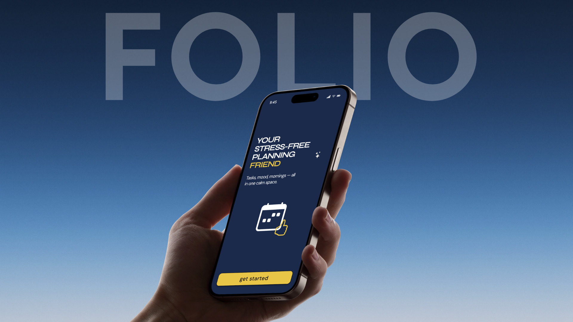
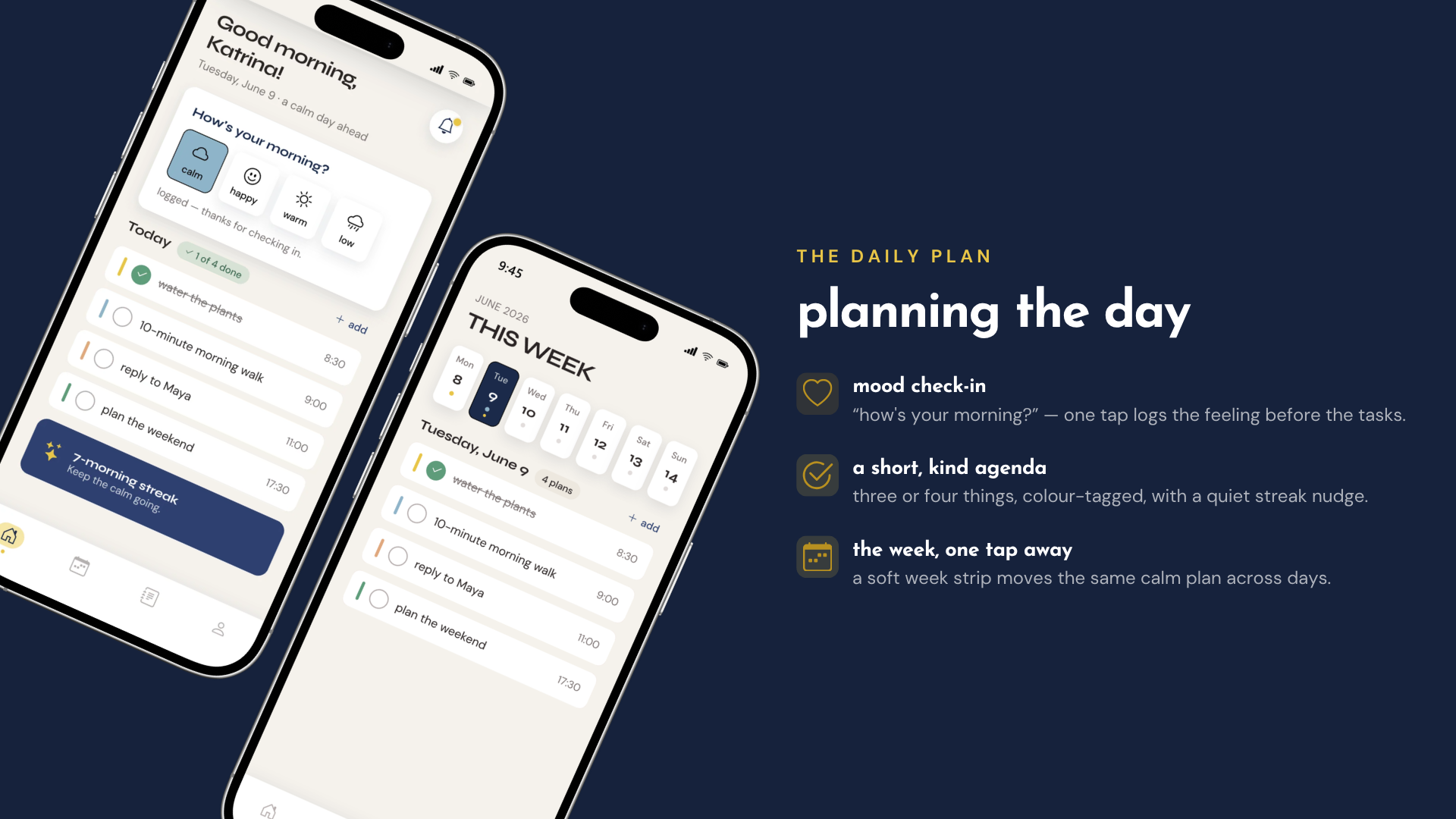
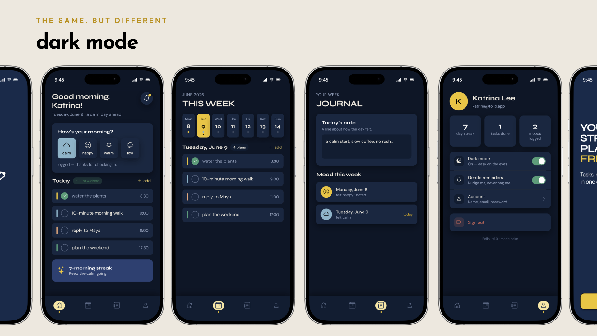
Existing planning apps tend to pile pressure onto the user — streaks that guilt you into compliance, notification badges that turn a to-do list into a source of anxiety, and mood or wellbeing left out of the picture entirely. Tasks live in one tab, feelings in another, if they're tracked at all. Folio brings tasks, mood, and morning routines into a single, unhurried screen. There are no red badges, no aggressive streak counters — just a calm space to plan the day and notice how it feels.
Most planners push users harder with streaks and badges, while mood tracking lives in a separate app — if it exists at all. The challenge was to bring tasks, mood, and morning routines into one calm surface without turning the day into a source of pressure.
How it took shape.
Research & principles
Research started with an audit of existing iOS planner apps — onboarding flows, navigation patterns, and core features — to understand what worked, what overwhelmed users, and where there was room to do something different. That led to three guiding principles: the plan should be ready when the day starts rather than something you're catching up on, mood deserves a place beside tasks rather than a separate tracker, and the interface should stay quiet rather than urgent. A single persona — a 28-year-old teacher who wants to "start the day knowing what matters without an app making her feel behind" — kept every decision honest throughout the process.
Structure
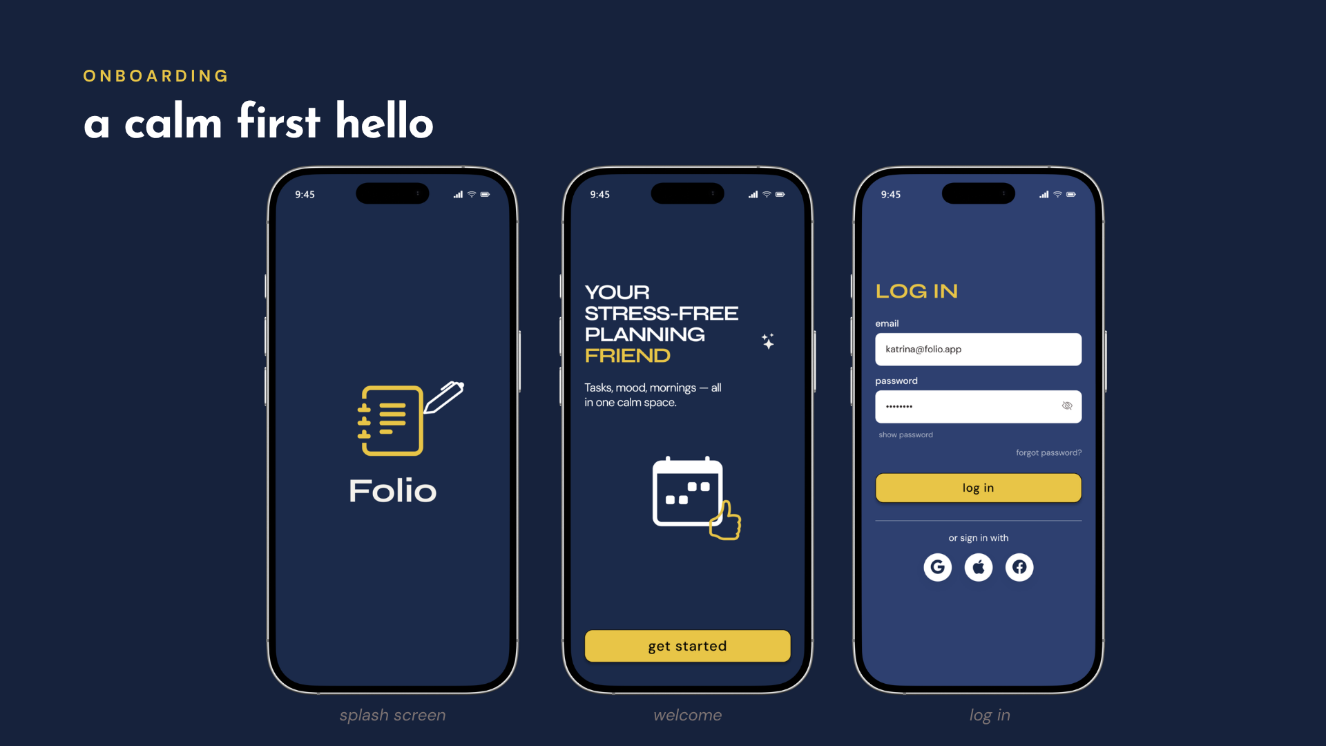
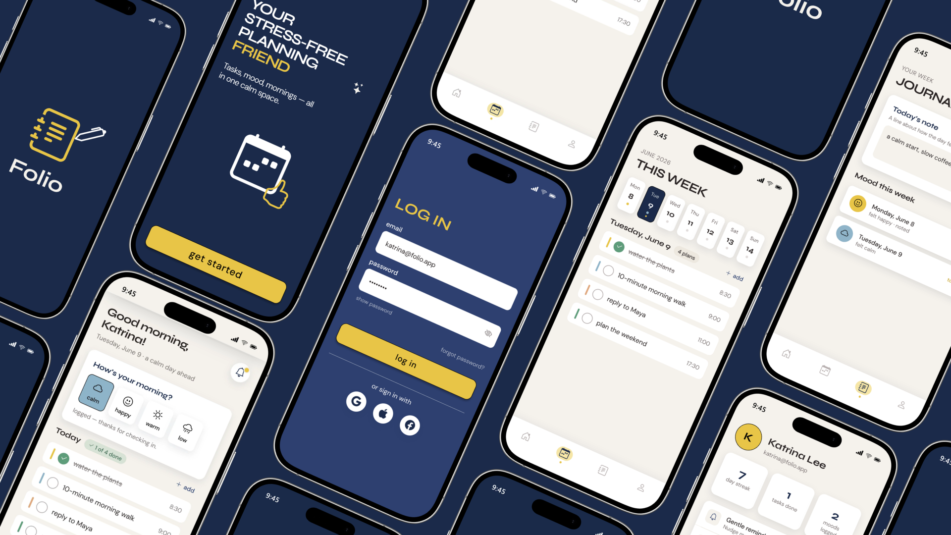
The flow stays deliberately shallow: open the app, log in or sign up, land on a home screen that opens with a mood check-in, then move into tasks. Everything important sits one screen deep, from first hello to a planned day.
Design system
The visual language pairs a deep navy with a single warm gold accent, kept calm with cream neutrals and three soft semantic colors for mood states (calm, warm, success). Typography pairs Syne for display and headings with DM Sans for body text and UI labels. Buttons, spacing, radius, and elevation were all defined as a small, reusable system rather than one-off styles — built to scale calmly across screens, not to impress on a single one.
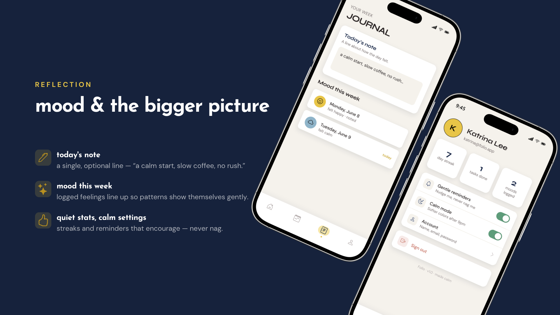
“The result is an app that handles three things — tasks, mood, and morning routines — without making any of them feel like an obligation. A user opens Folio, logs how they're feeling, checks a few things off, and closes it feeling lighter, not behind.”