Artist Portfolio & E-Commerce Website.
Polina Gasparovica
A modern, gallery-inspired website for contemporary painter Polina Gasparovica, built to showcase original artwork, support online sales, and let collectors and commission clients reach her through a calm, curated experience.

- UX/UI Designer
- Web Designer
- Site architecture
- E-commerce flow
- Editorial layout system
- Typography & color palette
The client wanted more than a static portfolio — she needed a site that could function as both a digital gallery and a working storefront, without ever feeling transactional. The challenge was designing an e-commerce experience for a product people can't touch, scroll past quickly, or judge for scale on a screen — while still meeting real conversion standards.
Research identified three core user types: independent art collectors who value authenticity and clean discovery over cluttered marketplaces, commission clients who want a direct, personal line to the artist, and interior-focused buyers who need to picture a piece in their own space before they trust it enough to buy. Each of these shaped a different part of the site — from in-room product imagery to a low-pressure commission inquiry flow.
How it took shape.
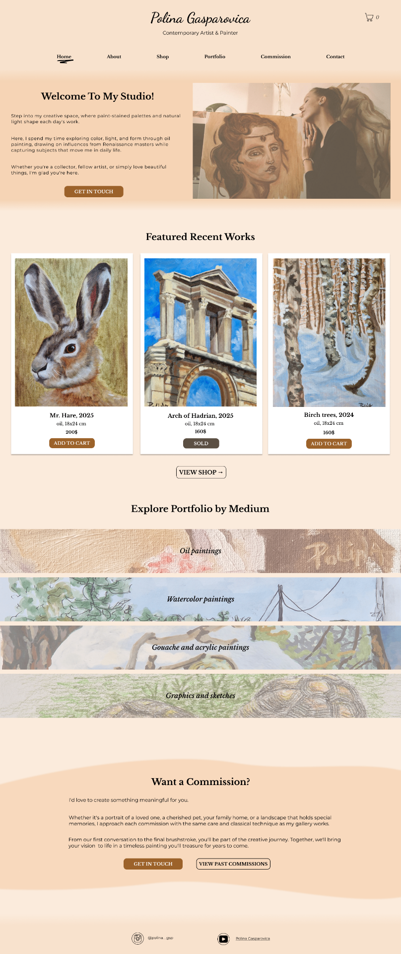
A homepage that opens like a gallery
The homepage acts as a digital gallery entrance: a warm welcome, featured recent works, and portfolio categories that guide visitors naturally from browsing into either a purchase or a commission inquiry — without ever feeling like a hard sell.
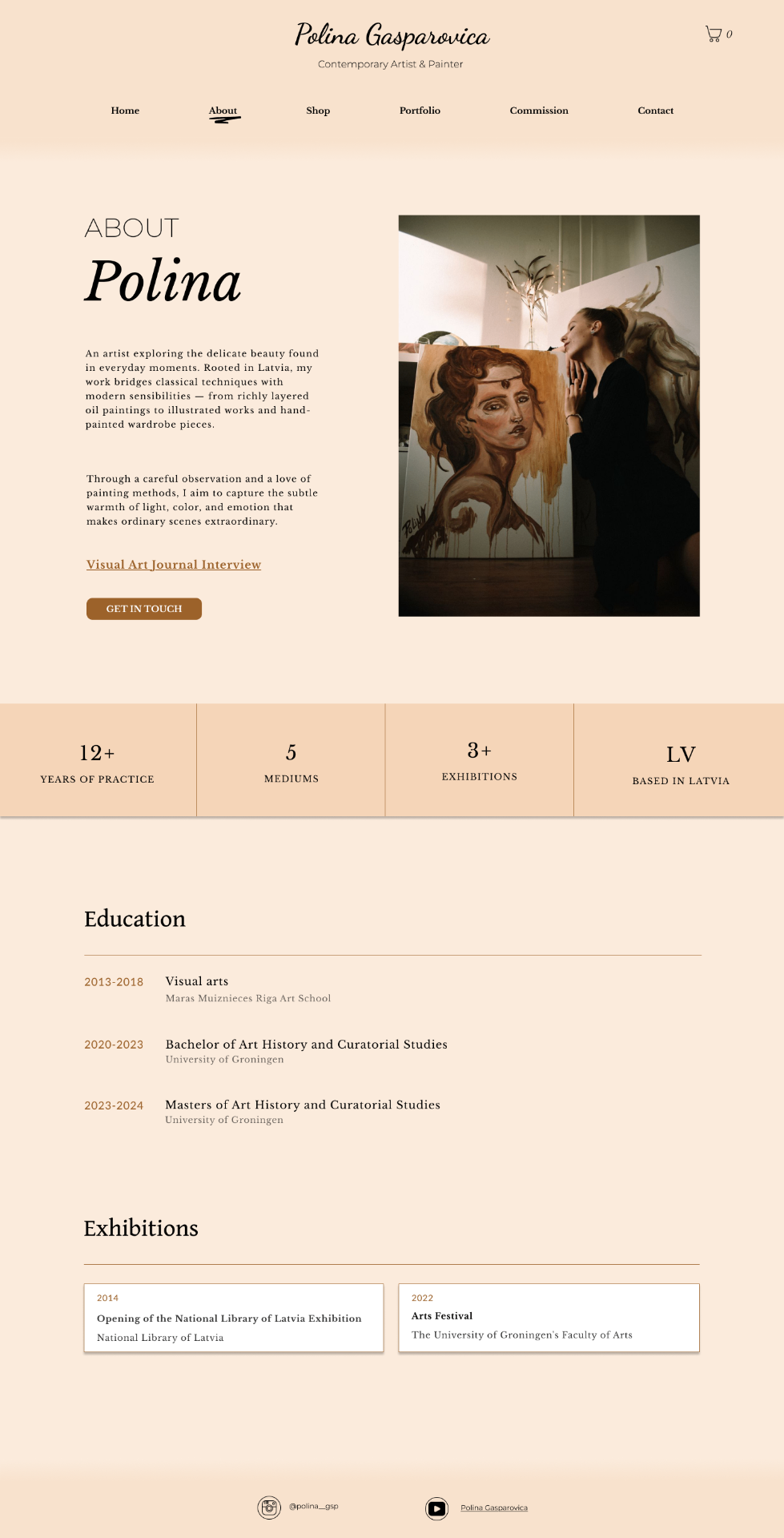
About as a trust-building engine
The About page was treated as a trust-building engine rather than a simple bio. Education, exhibition history, and years of practice are laid out as scannable proof points alongside a personal narrative, giving collectors the confidence to buy from an artist they've never met in person.
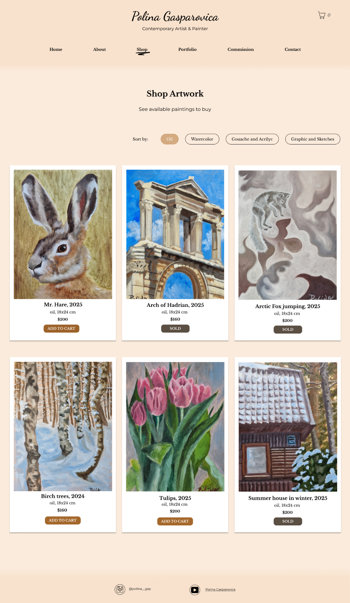
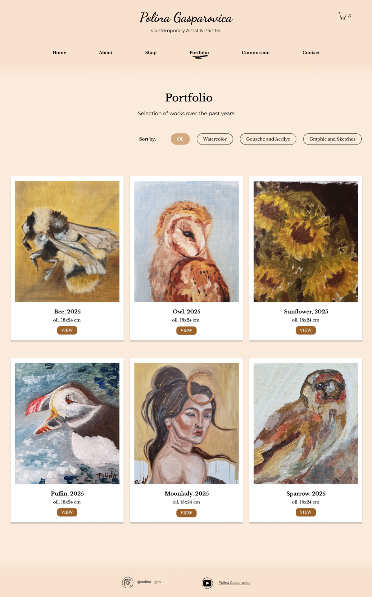
An adaptive portfolio grid
The portfolio uses an adaptive grid system rather than one rigid layout — a structured 3-column gallery for bold oil and acrylic pieces, and a softer, staggered "exploratory album" layout for watercolors and sketches, designed to slow scroll speed and shift the visitor's mindset from transactional browsing to artistic discovery.
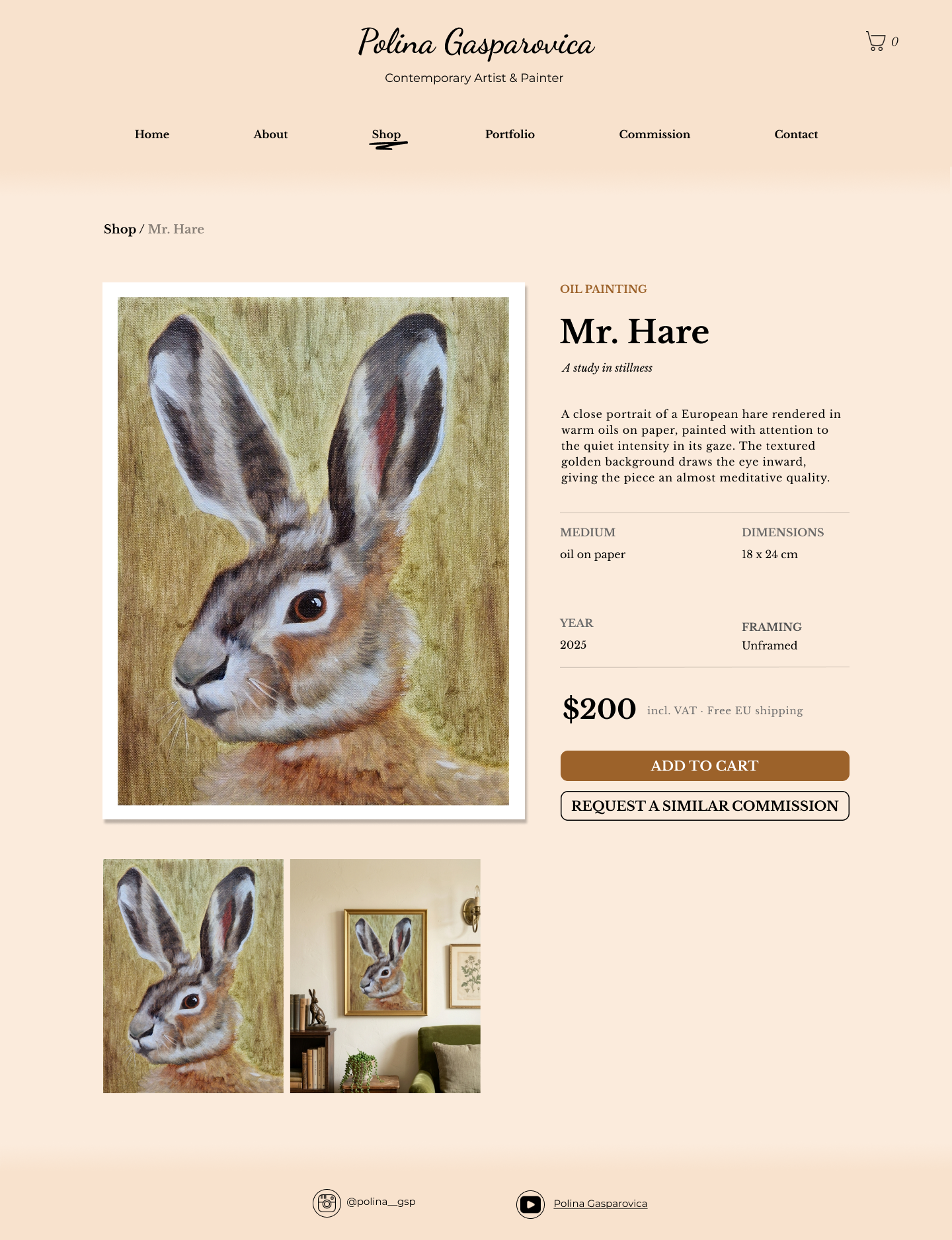
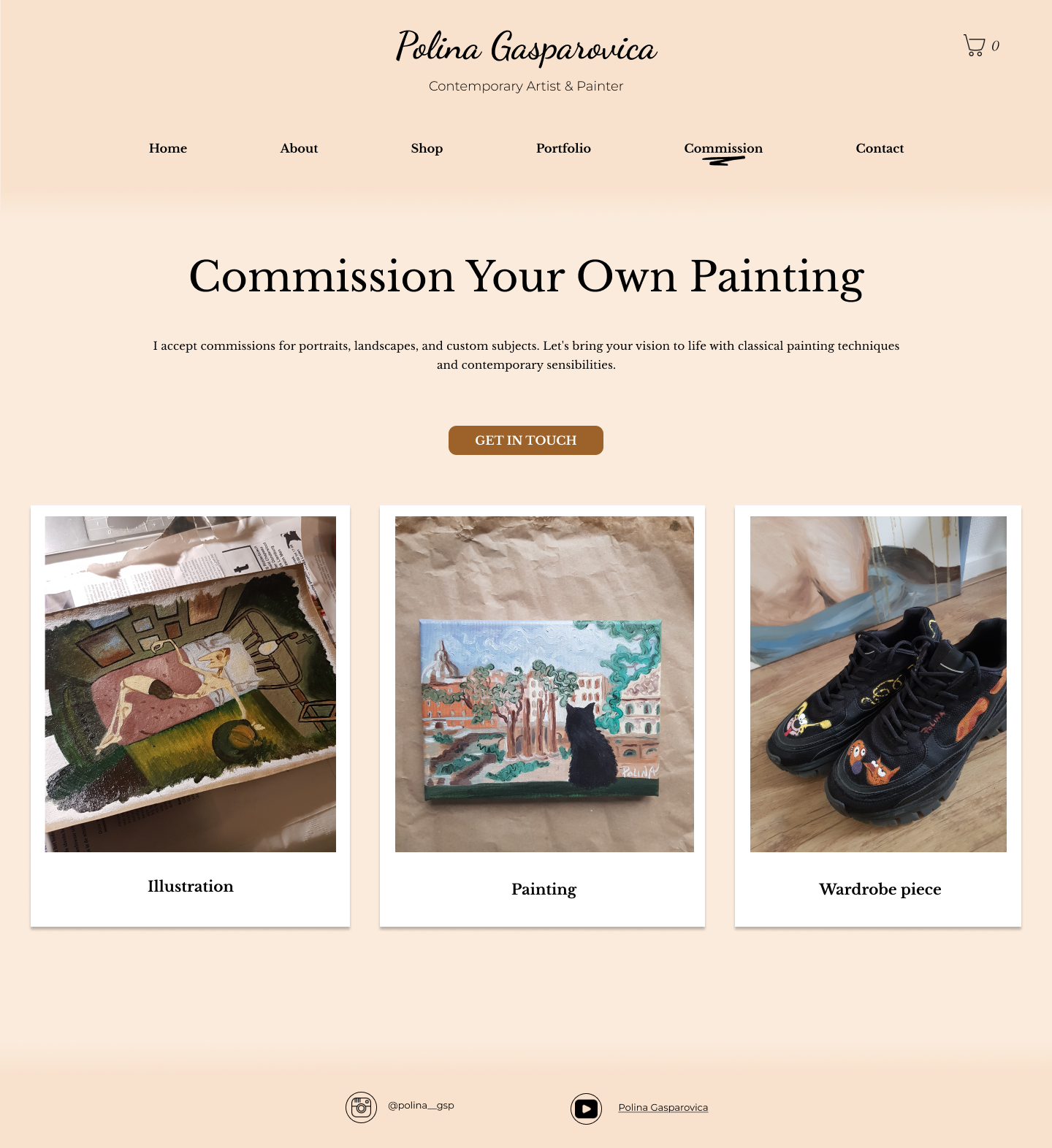
Product pages built for confidence
Product pages lead with an in-room contextual image to give instant scale and styling context, paired with a clean metadata grid (medium, dimensions, year, framing) so buyers can make a confident decision before committing. Every product offers two paths forward — "Add to Cart" for the original piece, or "Request a Similar Commission" to capture interest and create a secondary revenue stream if the original has sold.
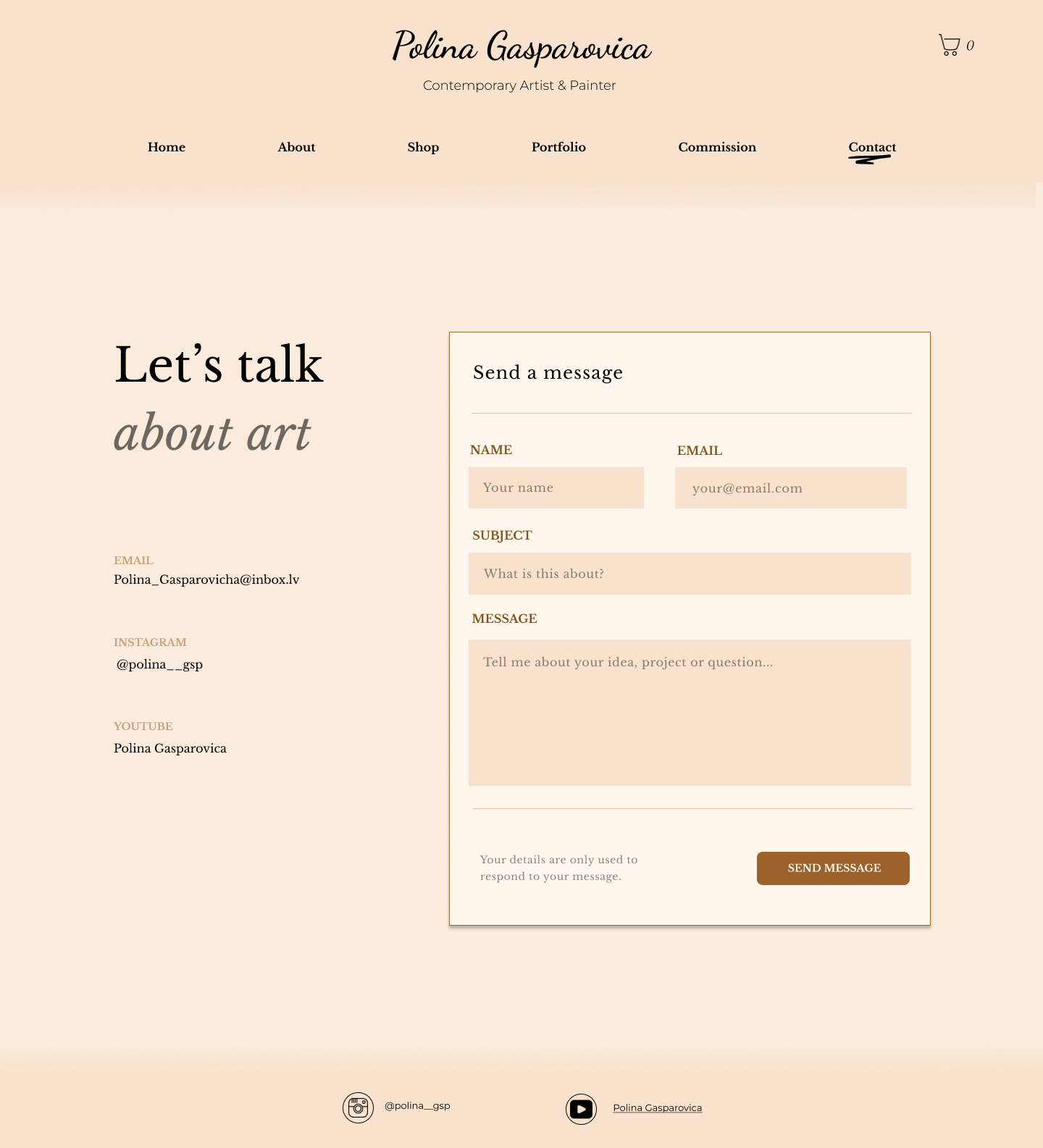
Reducing friction at checkout
The shopping cart was designed around its real function as the highest-friction point in any e-commerce flow: costs are shown clearly before checkout to prevent surprise-driven abandonment, and even an empty cart redirects the user back into the shop rather than ending the journey. Artwork cards throughout the site were styled after polaroid photographs, with soft shadowing that signals to the visitor they're browsing physical, original objects — not stock imagery.
“The result is a site that handles two very different jobs — gallery storytelling and e-commerce — without either one undercutting the other, giving Polina a digital space that feels as considered as the paintings it sells.”